 Because of nearly release of stable Firefox 5, first Mozilla's browser with CSS3 Animation support, I decide to create CSS3 demo for the Single Effect Compo.
Since I really enjoy all that 4chan-like mems stuff, I chose Nyan Cat, as one of the most 'fresh' ones. In case you don't know it (check the progress bar!):
I didn't use any graphics to code my CSS Nyan Cat. It is completely drawn and animated in CSS. The 'pop-tart' body is created with two rounded cornered divs and big, pink dots separated with non-breaking spaces:
#toastBody {
    background-color:#fad695;
    width:100px;
    height: 70px;
    border: solid #000 5px;
    border-radius: 15px;
    padding: 2px;
    position:absolute;
    z-index:19;
}

#toastBody > div {
    width:100px;
    height:70px;
    border-radius: 30px;
    background-color: #fc9dff;
    display:block;
    color: #da3eb9;
    font-size: 40px;
    line-height: 10px;
}
All the animations was declared with @-moz/webkit-keyframe (I wrote a lot about this method before). I made couple of unusual things during development. For example, look on the cat's mouth:

Yup, it is rotated 'E' letter:
<div id="mainHead" class="skin">
    <div class="mouth">E</div>
</div>

.mouth {
    position: absolute;
    -moz-transform: scale(2, 0.7) rotate(-90deg);
    -webkit-transform: scale(2, 0.7) rotate(-90deg);
    font-family: Arial;
    font-size: 25px;
    font-weight: bold;
    top:9px;
    left:37px;
    color: #000;
}
What about the rainbow behind the cat? I just cropped part of original image, put it into CSS Gradient Editor by ColorZilla (awesome tool BTW, but still without couple of necessary features I use daily; I think I will create something like this on my own), which generates me css gradient ready for pasting into the div background:.rainbow {
position:absolute;
width:45px;
height:90px;
background: -moz-linear-gradient (top, #d91a12 15%, #e13300 15%, #ff7f14 16%, #f2ab03 32%, #ebc000 32%, #fade00 33%, #efff03 48%, #56fc02 49%, #52ff01 66%, #4ade7e 67%, #3baaf2 67%, #3baaf2 84%, #7337f7 84%, #6b40f2 100%);
}The most annoying thing was the star. Animated stars in the background are made up from 8 animated elements. I google "nyan cat sprite" and found all the star frames [like this]. The only way to animate it was pixel-perfect animation of each of 8 divs. It took me really lot of time:@-moz-keyframes star1 {
0% { top: 0; height: 5px;}
33.19% { top: 0; height: 5px; }
33.2% { height:10px; top:0; }
49.79% { height:10px; top:0; }
49.8% { height:10px; top:5px; }
66.39% {height:10px; top:5px; }
66.4% { height:5px; top:10px;}
82.99% { height:5px; top:10px;}
83% { height: 5px; top: 15px; }
99.99% { height: 5px; top: 15px; }
100% { top: 0; height: 5px; }
}
@-moz-keyframes star2-3-6-7 {
0% { visibility: hidden; }
16.59% { visibility: hidden; }
16.6% { visibility: visible; }
33.19% { visibility: visible; }
33.2% { visibility: hidden; }
100% { visibility: hidden; }
}
@-moz-keyframes star4 {
0% { left: 0; width: 5px; visibility: visible;}
33.19% { left: 0; width: 5px; }
33.2% { width:10px; left:0; }
49.79% { width:10px; left:0; }
49.8% { width:10px; left:5px; }
66.39% {width:10px; left:5px; }
66.4% { width:5px; left:10px;}
82.99% { width:5px; left:10px;}
83% { width: 5px; left: 15px; visibility:hidden;}
99.99% { width: 5px; left: 15px; visibility:hidden;}
100% { left: 0; width: 5px; visibility:hidden;}
}
@-moz-keyframes star5 {
0% { left: 38px; width: 5px; visibility: visible;}
33.19% { left: 38px; width: 5px; }
33.2% { width:10px; left:33px; }
49.79% { width:10px; left:33px; }
49.8% { width:10px; left:28px; }
66.39% {width:10px; left:28px; }
66.4% { width:5px; left:28px;}
82.99% { width:5px; left:28px;}
83% { width: 5px; left: 15px; visibility:hidden;}
99.99% { width: 5px; left: 15px; visibility:hidden;}
100% { left: 0; width: 5px; visibility:hidden;}
}
@-moz-keyframes star8 {
0% { top: 32px; height: 5px; visibility:visible;}
33.19% { top: 32px; height: 5px; }
33.2% { height:10px; top:28px; }
49.79% { height:10px; top:28px; }
49.8% { height:10px; top:23px; }
66.39% {height:10px; top:23px; }
66.4% { height:5px; top:18px;}
82.99% { height:5px; top:18px;}
83% { height: 5px; top: 15px; visibility:hidden;}
99.99% { height: 5px; top: 15px; visibility:hidden;}
100% { top: 0; height: 5px; visibility:hidden;}
}
.star {
position: absolute;
width: 40px;
height: 40px;
z-index: 10;
}
.star div {
width: 5px;
height: 5px;
background-color: #fff;
position: absolute;
-moz-animation: star1 0.4s linear 0s infinite;
-webkit-animation: star1 0.4s linear 0s infinite;
}
Here is the final result of everything: CSS NYAN CAT, and Github repo. If you like it, don't forget to click "I like it" on Mozilla's page!
 Generator created in previous example was able only to create integer numbers from zero to the given maximum (2^50) using provided seed. But in most cases we need random numbers from some range, so lets modify previous example and add 'min' and 'max' arguments to the .next() method. Also, to make it more like the native Math.rand(), let's make it generating floats from 0 to 1.
 Introduction
 Generating pseudorandom sequences of numbers has wide variety of uses, ranging from creating random maps for games (with well constructed map generator all the game should remember is just the initial seed, not the array with list of map elements), to
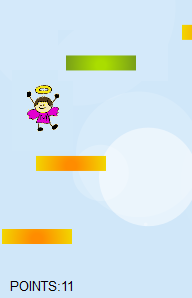
  I create simple 'Frames per seconds' counter and run it with 100 animated sprites, each with 4 frames (actually every sprite has 8 frames, but I used only 4 of them) and random movement. The sprites were penguins drawn by me some time ago, based on


 Because physics in StH is very simple, there is no need to include any Physics Engine such as
![[like this]](http://i1037.photobucket.com/albums/a453/DryBowser455/th_NyanCatSprite.png?t=1304659408)